Non-regression analysis
Andrew Heiss
July 28, 2016
Load libraries and data
library(magrittr)
library(dplyr)
library(feather)
library(tidyr)
library(purrr)
library(broom)
library(lubridate)
library(ggplot2)
library(ggstance)
library(gridExtra)
library(scales)
library(Cairo)

source(file.path(PROJHOME, "Analysis", "lib", "graphic_functions.R"))

full.data <- read_feather(file.path(PROJHOME, "Data", "data_processed",
                                    "full_data.feather"))

my.seed <- 1234
set.seed(my.seed)
General data summary
Number of countries:
length(unique(full.data$Country))## [1] 130Range of years:
min(full.data$year.num)## [1] 1991max(full.data$year.num)## [1] 2015Understanding and visualizing civil society environment
The V-Dem Bayesian measurement model is cool and all, but it’s really hard to interpret by itself. Showing a few example countries can help.
cs.plot.all <- full.data %>%
  filter(year.num > 2000) %>%
  group_by(Country) %>%
  summarise(env.mean = mean(cs_env_sum, na.rm=TRUE)) %>%
  filter(!is.na(env.mean)) %>%
  arrange(env.mean) %>%
  ungroup()

cs.plot <- bind_rows(cs.plot.all %>% slice(1:5),
                     data_frame(Country = "—", env.mean = 0),
                     cs.plot.all %>% slice((nrow(.) - 4):nrow(.))) %>%
  mutate(Country = factor(Country, levels=unique(Country), ordered=TRUE))
The usual suspects get their scores
cs.plot| Country | env.mean |
|---|---|
| North Korea | -6.096056 |
| Cuba | -3.142303 |
| Syria | -3.015231 |
| Libya | -3.011029 |
| Myanmar | -2.682016 |
| — | 0.000000 |
| Brazil | 5.799338 |
| Estonia | 6.086975 |
| Costa Rica | 6.215544 |
| Norway | 6.232822 |
| France | 6.807109 |
Average volatility/range by regime type:
cs.plot.all %>%
  left_join(select(full.data, Country, polity_ord), by="Country") %>%
group_by(polity_ord) %>% summarise(index.change.avg = mean(env.mean))| polity_ord | index.change.avg |
|---|---|
| Autocracy | -0.316877 |
| Anocracy | 1.626376 |
| Democracy | 3.732983 |
| NA | 1.859263 |
cs.plot.all %>%
  left_join(select(full.data, Country, polity_ord2), by="Country") %>%
group_by(polity_ord2) %>% summarise(index.change.avg = mean(env.mean))| polity_ord2 | index.change.avg |
|---|---|
| Autocracy | 0.5179618 |
| Democracy | 3.4138055 |
| NA | 1.8592626 |
cs.plot.all %>%
  left_join(select(full.data, Country, gwf.binary), by="Country") %>%
group_by(gwf.binary) %>% summarise(index.change.avg = mean(env.mean))| gwf.binary | index.change.avg |
|---|---|
| Autocracy | 0.8720814 |
| Democracy | 3.7391560 |
| NA | 2.0991161 |
plot.csre.top.bottom <- ggplot(cs.plot, aes(x=Country, y=env.mean)) +
  geom_point(size=2) +
  geom_segment(aes(yend=0, xend=Country), size=1) +
  labs(x=NULL, y="Mean civil society regulatory environment index (CSRE)") +
  coord_flip() +
  theme_ath()
plot.csre.top.bottom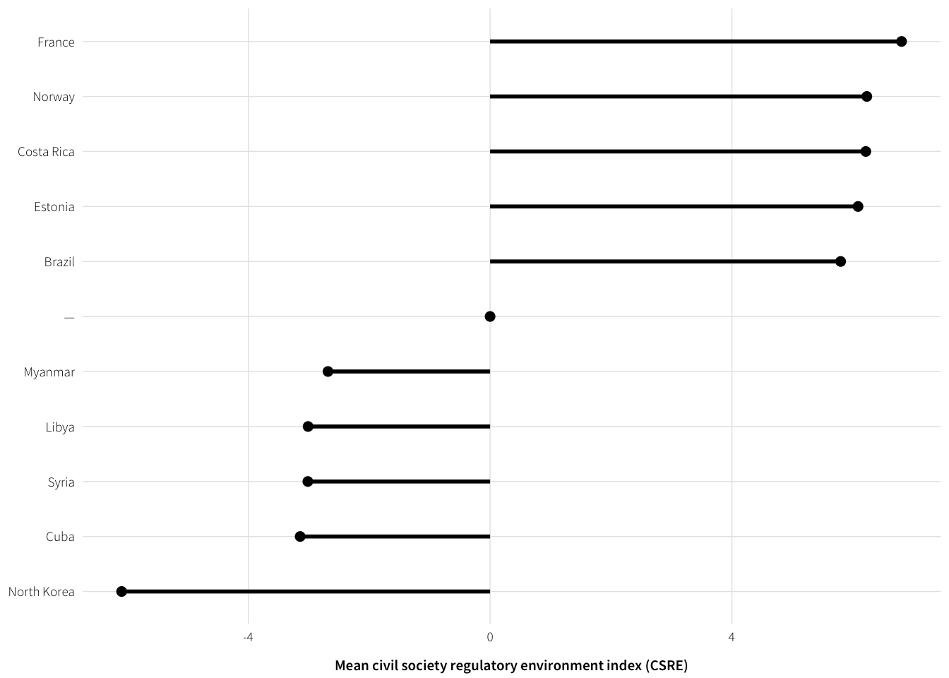
fig.save.cairo(plot.csre.top.bottom, filename="1-csre-top-bottom",
               width=5, height=2.5)
Visualizing basic correlation between regime type and CSRE
Regime type and CSRE are quite correlated
plot.data <- full.data %>%
  select(cs_env_sum, uds_mean, e_polity2) %>%
  na.omit()

plot.data %>%
summarise_each(funs(cor(., plot.data$cs_env_sum)), -cs_env_sum)| uds_mean | e_polity2 |
|---|---|
| 0.8479438 | 0.83553 |
You can see that visually too
plot.polity <- ggplot(plot.data, aes(x=e_polity2, y=cs_env_sum)) +
  geom_vline(xintercept=0, colour="#EA2E49", size=0.5) +
  geom_point(size=0.25, alpha=0.25) +
  geom_smooth(method="lm", se=TRUE, colour="#014358") +
  labs(x="Polity IV score",
       y="Civil society regulatory environment\n(CSRE)") +
  scale_y_continuous(breaks=seq(-6, 6, 2)) +
  coord_cartesian(ylim=c(-6, 6)) +
  theme_ath()

plot.uds <- ggplot(plot.data, aes(x=uds_mean, y=cs_env_sum)) +
  geom_vline(xintercept=0, colour="#EA2E49", size=0.5) +
  geom_point(size=0.25, alpha=0.25) +
  geom_smooth(method="lm", se=TRUE, colour="#014358") +
  labs(x="Mean UDS score", y=NULL) +
  scale_y_continuous(breaks=seq(-6, 6, 2)) +
  coord_cartesian(ylim=c(-6, 6)) +
  theme_ath()

# GWF regime type and Polity/UDS and CSRE
gwf.summary <- full.data %>%
  group_by(gwf.binary) %>%
  summarise(env.avg = mean(cs_env_sum, na.rm=TRUE),
            env.sd = sd(cs_env_sum, na.rm=TRUE),
            env.se = env.sd / sqrt(n()),
            env.upper = env.avg + (qnorm(0.975) * env.se),
            env.lower = env.avg + (qnorm(0.025) * env.se)) %>%
  na.omit

plot.gwf.csre <- ggplot(gwf.summary, aes(x=gwf.binary, y=env.avg)) +
  geom_pointrange(aes(ymin=env.lower, ymax=env.upper), size=0.5) +
  geom_point(data=full.data, aes(y=cs_env_sum), size=0.25, alpha=0.05) +
  labs(y=NULL, x="Geddes et al. categorization") +
  scale_y_continuous(breaks=seq(-6, 6, 2)) +
  coord_cartesian(ylim=c(-6, 6)) +
  theme_ath()

plot.regime.csre <- arrangeGrob(plot.polity, plot.uds, plot.gwf.csre, nrow=1)
## Warning: Removed 1483 rows containing missing values (geom_point).grid::grid.draw(plot.regime.csre)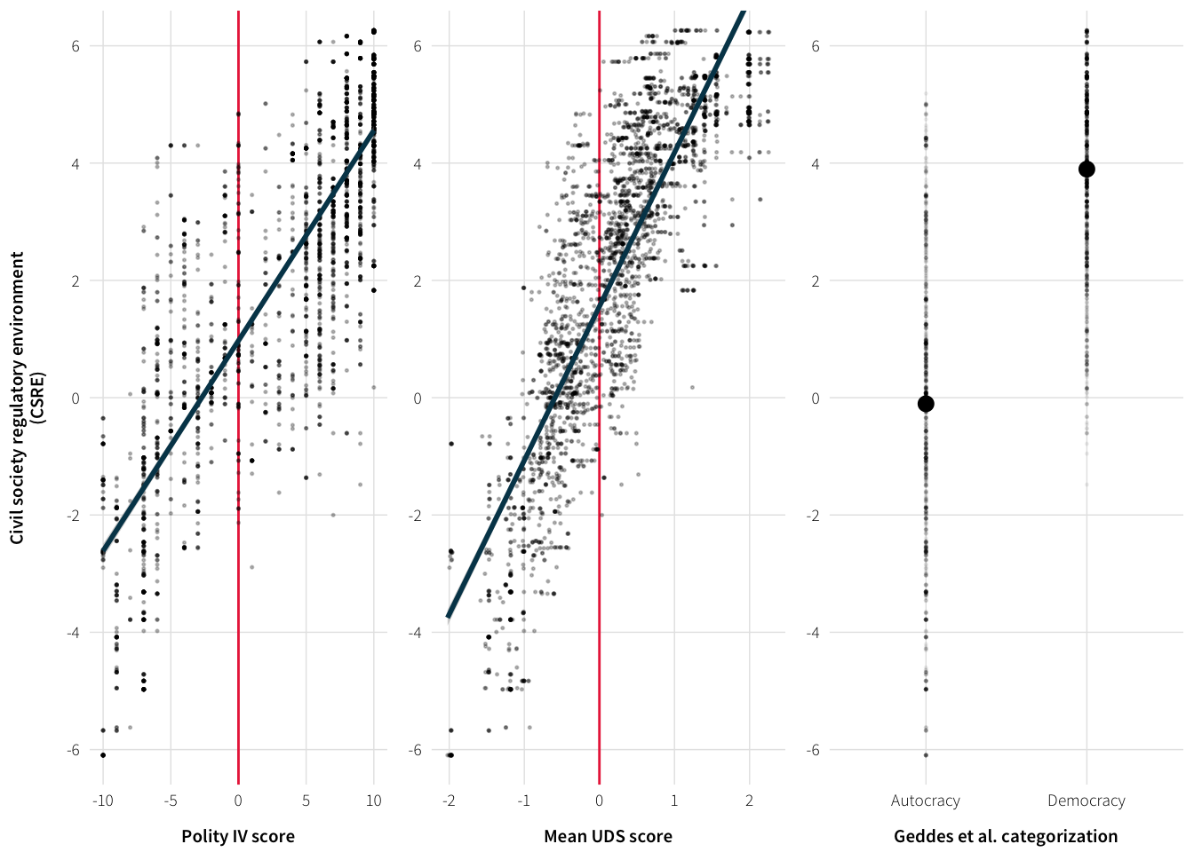
fig.save.cairo(plot.regime.csre, filename="1-regime-csre",
               width=5, height=2)
Understanding and visualizing ICRG
Conceptualizing the political risk measure is a little tricky. Showing a few example countries can help. Figure out which countries have change the least/most since 2000:
risk.stats <- full.data %>%
  filter(year.num > 2000) %>%
  group_by(Country) %>%
  summarise(index.change = max(icrg.pol.risk.internal.scaled) -
              min(icrg.pol.risk.internal.scaled)) %>%
  filter(!is.na(index.change)) %>%
  arrange(index.change) %T>%
  {print(head(., 5))} %>% {print(tail(., 5))}
## # A tibble: 5 x 2
## Country index.change
## <chr> <dbl>
## 1 Congo 2.794715
## 2 Norway 3.302846
## 3 Gabon 3.607724
## 4 Myanmar 4.065041
## 5 Congo, DR 4.573171
## # A tibble: 5 x 2
## Country index.change
## <chr> <dbl>
## 1 Libya 19.76626
## 2 Ireland 19.81707
## 3 Egypt 20.07114
## 4 Algeria 20.37602
## 5 Syria 27.23577Norway and Congo are the most consistent; Syria saw the biggest change.
Average volatility/range by regime type:
risk.stats %>%
  left_join(select(full.data, Country, polity_ord), by="Country") %>%
group_by(polity_ord) %>% summarise(index.change.avg = mean(index.change))| polity_ord | index.change.avg |
|---|---|
| Autocracy | 22.73120 |
| Anocracy | 20.23374 |
| Democracy | 19.81707 |
| NA | 20.94131 |
risk.stats %>%
  left_join(select(full.data, Country, polity_ord2), by="Country") %>%
group_by(polity_ord2) %>% summarise(index.change.avg = mean(index.change))| polity_ord2 | index.change.avg |
|---|---|
| Autocracy | 22.06790 |
| Democracy | 19.97935 |
| NA | 20.94131 |
risk.stats %>%
  left_join(select(full.data, Country, gwf.binary), by="Country") %>%
group_by(gwf.binary) %>% summarise(index.change.avg = mean(index.change))| gwf.binary | index.change.avg |
|---|---|
| Autocracy | 21.86230 |
| Democracy | 19.81707 |
| NA | 21.45325 |
Visualize changes:
example.countries <- c(652, 385, 484)
example.stability <- full.data %>%
  filter(year.num > 2000, cowcode %in% example.countries) %>%
  mutate(country.plot = factor(Country,
                               levels=c("Norway", "Syria", "Congo"),
                               ordered=TRUE))

# example.stability$icrg.pol.grade.internal
# c(0, 49.99, 59.99, 69.99, 79.99, Inf)
plot.icrg.examples <- ggplot(example.stability,
                             aes(x=year.actual,
                                 y=icrg.pol.risk.internal.scaled,
                                 colour=country.plot)) +
  geom_line(size=1.5) +
  labs(x=NULL, y="Internal political risk (ICRG)") +
  coord_cartesian(xlim=ymd(c("2000-01-01", "2015-01-01"))) +
  scale_colour_manual(values=c("#014358", "#FD7401", "#BEDB3A"), name=NULL) +
  theme_ath()
plot.icrg.examples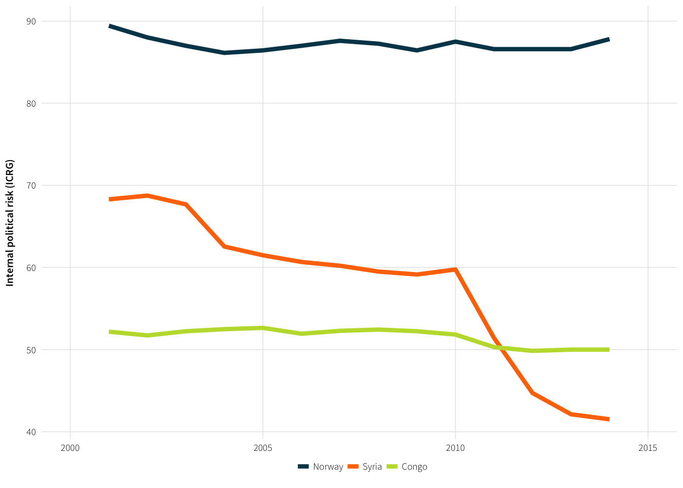
fig.save.cairo(plot.icrg.examples, filename="1-icrg-examples",
               width=5, height=2)
ICRG across regime type
Are autocracies necessarily more unstable than democracies? They are more volatile, as shown above with risk.stats summaries…
plot.data <- full.data %>%
  group_by(gwf.binary, year.actual) %>%
  summarise(icrg = mean(icrg.pol.risk.internal.scaled, na.rm=TRUE),
            icrg.sd = sd(icrg.pol.risk.internal.scaled, na.rm=TRUE),
            icrg.se = icrg.sd / sqrt(n()),
            icrg.upper = icrg + (qnorm(0.975) * icrg.se),
            icrg.lower = icrg + (qnorm(0.025) * icrg.se)) %>%
  na.omit() %>%
  ungroup() %>%
  mutate(gwf.binary = factor(gwf.binary, levels=c("Democracy", "Autocracy"),
                             labels=c("Democracies    ", "Autocracies")))

plot.icrg.regime <- ggplot(plot.data, aes(x=year.actual, y=icrg,
                                          colour=gwf.binary)) +
  geom_ribbon(aes(ymin=icrg.lower, ymax=icrg.upper, fill=gwf.binary),
              alpha=0.3, colour=NA) +
  geom_line(size=1.5) +
  labs(x=NULL, y="Mean internal political risk (ICRG)") +
  scale_colour_manual(values=c(col.dem, col.auth), name=NULL) +
  scale_fill_manual(values=c(col.dem, col.auth), name=NULL, guide=FALSE) +
  theme_ath()
plot.icrg.regime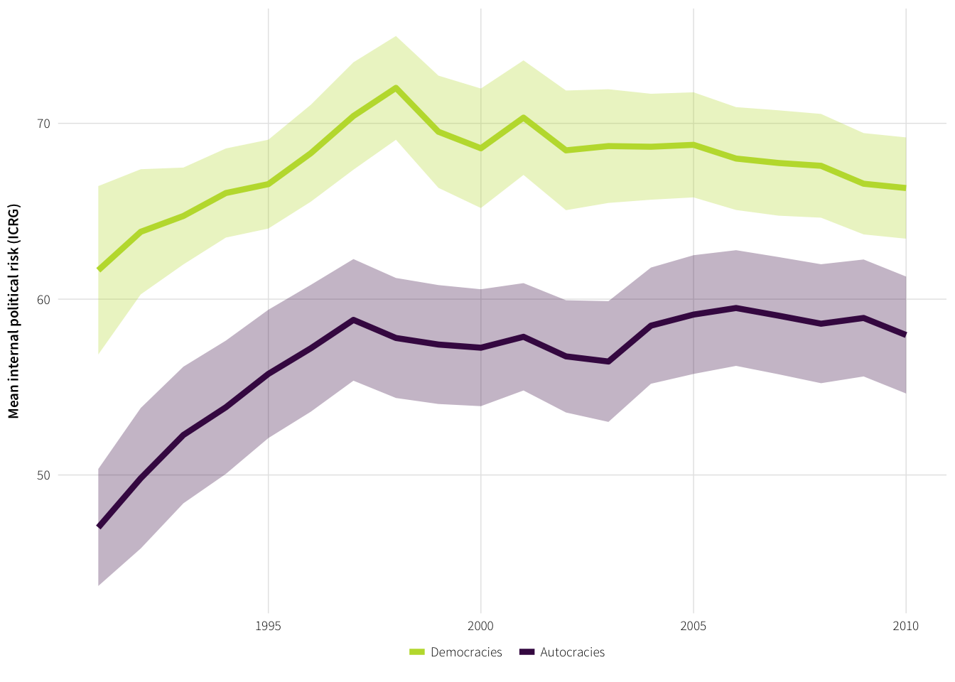
fig.save.cairo(plot.icrg.regime, filename="1-icrg-regime",
               width=5, height=3)
Check if the difference in means is significant in each year
year.diffs <- full.data %>%
  select(gwf.binary, year.num, icrg.pol.risk.internal.scaled) %>%
  na.omit() %>%
  group_by(year.num) %>%
  do(tidy(t.test(icrg.pol.risk.internal.scaled ~ gwf.binary, data=.)))

year.diffs %>% select(1:6) %>% print(n=nrow(.))
## Source: local data frame [20 x 6]
## Groups: year.num [20]
##
## year.num estimate estimate1 estimate2 statistic p.value
## <dbl> <dbl> <dbl> <dbl> <dbl> <dbl>
## 1 1991 -14.628779 47.01362 61.64240 -4.916415 4.057853e-06
## 2 1992 -14.015009 49.81629 63.83130 -4.887999 3.898728e-06
## 3 1993 -12.457222 52.27290 64.73013 -4.929161 3.470461e-06
## 4 1994 -12.184781 53.85163 66.03641 -5.027880 2.534530e-06
## 5 1995 -10.794577 55.74752 66.54209 -4.551420 1.799641e-05
## 6 1996 -11.094540 57.20621 68.30075 -4.569834 1.586503e-05
## 7 1997 -11.596676 58.82114 70.41781 -4.697399 8.642876e-06
## 8 1998 -14.224174 57.79202 72.01619 -5.952591 3.753401e-08
## 9 1999 -12.103957 57.41870 69.52266 -5.101275 1.384338e-06
## 10 2000 -11.343099 57.23826 68.58136 -4.675969 8.132532e-06
## 11 2001 -12.464450 57.85869 70.32314 -5.471518 2.771680e-07
## 12 2002 -11.717572 56.74584 68.46341 -4.921817 2.969395e-06
## 13 2003 -12.254173 56.45247 68.70664 -5.091675 1.567803e-06
## 14 2004 -10.175838 58.49286 68.66870 -4.459799 2.194878e-05
## 15 2005 -9.653980 59.12312 68.77710 -4.196184 6.165725e-05
## 16 2006 -8.501555 59.49549 67.99704 -3.784545 2.673390e-04
## 17 2007 -8.683644 59.06131 67.74496 -3.796688 2.528076e-04
## 18 2008 -8.981813 58.60279 67.58460 -3.920897 1.646835e-04
## 19 2009 -7.634443 58.92995 66.56440 -3.399936 9.935484e-04
## 20 2010 -8.360392 57.95905 66.31944 -3.723539 3.333923e-04Yup. They are.
Other authoritarian stability variables and CSRE
All three variables seem moderately correlated with the CSRE
plot.data <- full.data %>%
  select(cs_env_sum, yrsoffc, years.since.comp, opp1vote) %>%
  na.omit()

plot.data %>%
summarise_each(funs(cor(., plot.data$cs_env_sum)), -cs_env_sum)| yrsoffc | years.since.comp | opp1vote |
|---|---|---|
| -0.4754157 | -0.5129839 | 0.5151119 |
Plot the correlations
plot.yrs.offc <- ggplot(plot.data, aes(x=yrsoffc, y=cs_env_sum)) +
  geom_point(size=0.25, alpha=0.25) +
  geom_smooth(method="lm", se=TRUE, colour="#014358") +
  labs(x="Years executive has been in office",
       y="Civil society regulatory environment\n(CSRE)") +
  scale_y_continuous(breaks=seq(-6, 6, 2)) +
  theme_ath()

plot.yrs.since.comp <- ggplot(plot.data,
                              aes(x=years.since.comp, y=cs_env_sum)) +
  geom_point(size=0.25, alpha=0.25) +
  geom_smooth(method="lm", se=TRUE, colour="#014358") +
  labs(x="Years since a competitive election", y=NULL) +
  scale_y_continuous(breaks=seq(-6, 6, 2)) +
  theme_ath()

plot.opp.vote <- ggplot(plot.data, aes(x=opp1vote, y=cs_env_sum)) +
  geom_point(size=0.25, alpha=0.25) +
  geom_smooth(method="lm", se=TRUE, colour="#014358") +
  labs(x="Vote share for largest opposition party", y=NULL) +
  scale_y_continuous(breaks=seq(-6, 6, 2)) +
  theme_ath()

plot.auth.vars <- arrangeGrob(plot.yrs.offc, plot.yrs.since.comp,
                              plot.opp.vote, nrow=1)
grid::grid.draw(plot.auth.vars)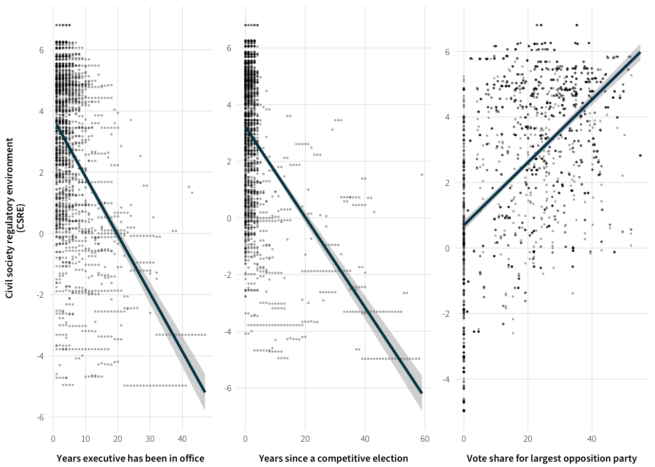
fig.save.cairo(plot.auth.vars, filename="1-auth-vars",
               width=6, height=2)
ICRG stability and competition
plot.data <- full.data %>%
  select(icrg.pol.risk.internal.scaled, yrsoffc, years.since.comp, opp1vote) %>%
  na.omit()

plot.data %>%
  summarise_each(funs(cor(., plot.data$icrg.pol.risk.internal.scaled)),
-icrg.pol.risk.internal.scaled)| yrsoffc | years.since.comp | opp1vote |
|---|---|---|
| -0.1941299 | -0.2782814 | 0.3723299 |
plot.yrs.offc <- ggplot(plot.data, aes(x=yrsoffc, y=icrg.pol.risk.internal.scaled)) +
  geom_point(size=0.25, alpha=0.25) +
  geom_smooth(method="lm", se=TRUE, colour="#014358") +
  labs(x="Years executive has been in office",
       y="ICRG") +
  scale_y_continuous(breaks=seq(-0, 100, 20)) +
  theme_ath()

plot.yrs.since.comp <- ggplot(plot.data,
                              aes(x=years.since.comp, y=icrg.pol.risk.internal.scaled)) +
  geom_point(size=0.25, alpha=0.25) +
  geom_smooth(method="lm", se=TRUE, colour="#014358") +
  labs(x="Years since a competitive election", y=NULL) +
  scale_y_continuous(breaks=seq(-0, 100, 20)) +
  theme_ath()

plot.opp.vote <- ggplot(plot.data, aes(x=opp1vote, y=icrg.pol.risk.internal.scaled)) +
  geom_point(size=0.25, alpha=0.25) +
  geom_smooth(method="lm", se=TRUE, colour="#014358") +
  labs(x="Vote share for largest opposition party", y=NULL) +
  scale_y_continuous(breaks=seq(-0, 100, 20)) +
  theme_ath()

plot.auth.vars <- arrangeGrob(plot.yrs.offc, plot.yrs.since.comp,
                              plot.opp.vote, nrow=1)
grid::grid.draw(plot.auth.vars)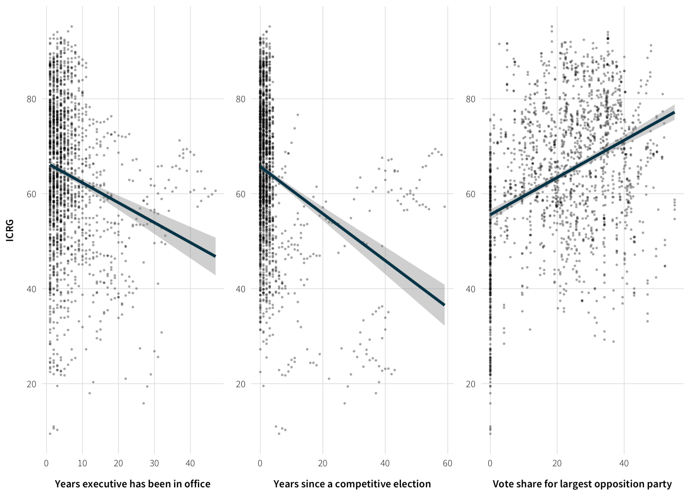
Neighboring and regional ICRG risk
Example of Kenya’s neighborhood in 2012
kenya.neighbors <- full.data %>%
  filter(year.num == 2012, cowcode == 501) %>%
  mutate(neighbors.cow = strsplit(neighbors.cow, ",")) %>%
  select(neighbors.cow) %>% unlist %>% map_dbl(as.numeric)

full.data %>%
  filter(year.num == 2012, cowcode %in% kenya.neighbors) %>%
select(Country, icrg.pol.risk.internal.scaled)| Country | icrg.pol.risk.internal.scaled |
|---|---|
| Uganda | 47.61179 |
| Tanzania | 58.63821 |
| Somalia | 22.86585 |
| Ethiopia | 45.93496 |
| NA | NA |
Visualize neighbor and subregional instability
plot.data <- full.data %>%
  select(cs_env_sum, neighbor.pol.risk.min, icrg.pol.risk.subregional)
Plot the correlations
plot.neighbor.risk <- ggplot(plot.data, aes(x=neighbor.pol.risk.min,
                                            y=cs_env_sum)) +
  geom_point(size=0.25, alpha=0.25) +
  geom_smooth(method="lm", se=TRUE, colour="#014358") +
  labs(x="Minimum political risk in neighboring country",
       y="Civil society regulatory environment\n(CSRE)") +
  scale_y_continuous(breaks=seq(-6, 6, 2)) +
  theme_ath()

plot.subregion.risk <- ggplot(plot.data, aes(x=icrg.pol.risk.subregional,
                                             y=cs_env_sum)) +
  geom_point(size=0.25, alpha=0.25) +
  geom_smooth(method="lm", se=TRUE, colour="#014358") +
  labs(x="Mean political risk in subregion",
       y=NULL) +
  scale_y_continuous(breaks=seq(-6, 6, 2)) +
  theme_ath()

plot.ext.vars <- arrangeGrob(plot.neighbor.risk, plot.subregion.risk, nrow=1)
## Warning: Removed 935 rows containing non-finite values (stat_smooth).## Warning: Removed 935 rows containing missing values (geom_point).## Warning: Removed 1227 rows containing non-finite values (stat_smooth).## Warning: Removed 1227 rows containing missing values (geom_point).grid::grid.draw(plot.ext.vars)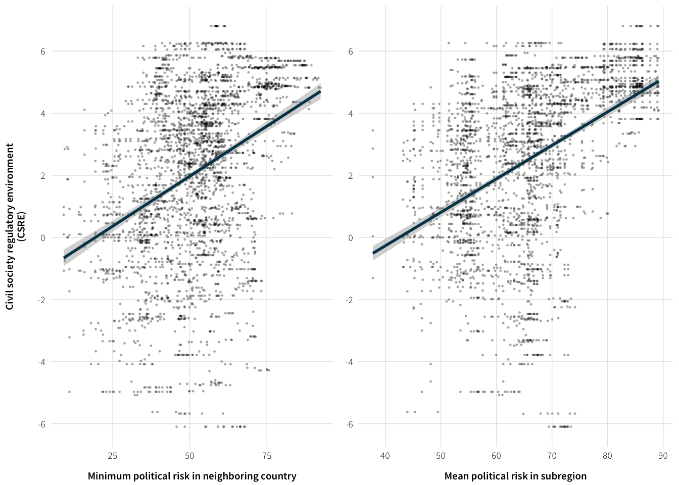
fig.save.cairo(plot.ext.vars, filename="1-ext-risk-vars",
               width=6, height=2)
The two external risk variables are fairly correlated though
cor(plot.data$icrg.pol.risk.subregional,
    plot.data$neighbor.pol.risk.min, use="complete.obs")
## [1] 0.7044036plot.risk.cor <- ggplot(plot.data, aes(x=icrg.pol.risk.subregional,
y=neighbor.pol.risk.min)) +
geom_point(size=0.25, alpha=0.25) +
geom_smooth(method="lm", se=TRUE, colour="#014358") +
labs(x="Mean political risk in subregion",
y="Minimum political risk in neighboring country") +
theme_ath()
plot.risk.cor## Warning: Removed 1401 rows containing non-finite values (stat_smooth).## Warning: Removed 1401 rows containing missing values (geom_point).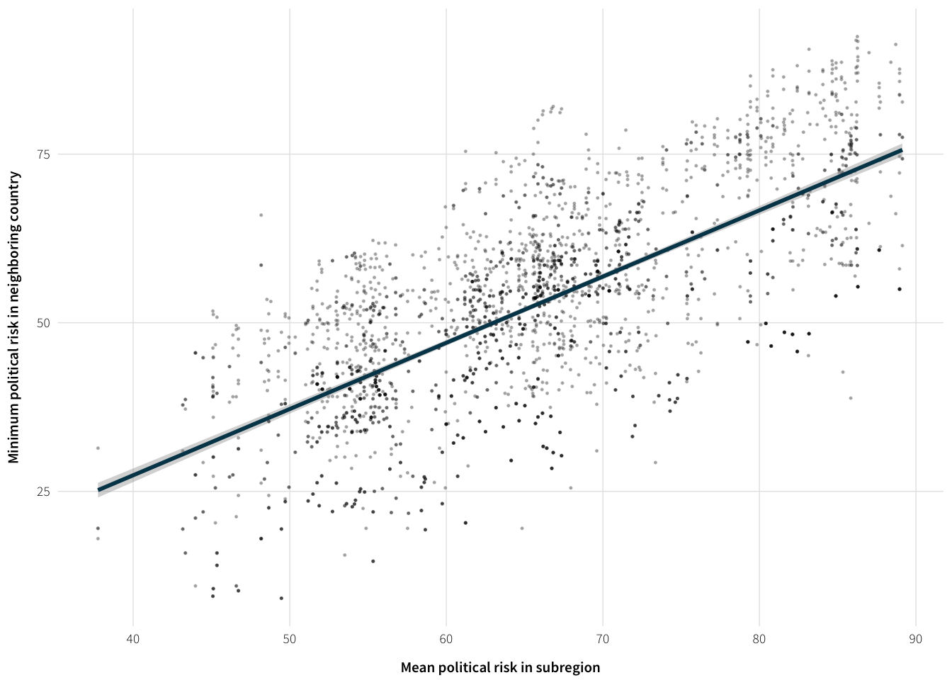
Visualize coups
plot.data <- full.data %>%
  select(cs_env_sum, neighbor.coups.activity.bin, coups.activity.subregional) %>%
  na.omit %>%
  mutate(neighbor.coups.activity.bin = factor(neighbor.coups.activity.bin,
                                              labels=c("No coup activity",
                                                       "Coup activity")),
         coups.activity.subregional = factor(coups.activity.subregional))

plot.coups.neighbor <- ggplot(plot.data, aes(x=neighbor.coups.activity.bin,
                                             y=cs_env_sum)) +
  geom_violin() +
  geom_point(size=0.15, alpha=0.15, position="jitter") +
  geom_point(stat="summary", fun.y="mean", size=2) +
  labs(x="Coup activity in neighboring countries",
       y="Civil society regulatory environment\n(CSRE)") +
  scale_y_continuous(breaks=seq(-6, 6, 2)) +
  theme_ath()

plot.coups.subregion <- ggplot(plot.data, aes(x=coups.activity.subregional,
                                              y=cs_env_sum)) +
  geom_violin() +
  geom_point(size=0.15, alpha=0.15, position="jitter") +
  geom_point(stat="summary", fun.y="mean", size=2) +
  labs(x="Coup attemps in subregion",
       y=NULL) +
  scale_y_continuous(breaks=seq(-6, 6, 2)) +
  theme_ath()

plot.coup.vars <- arrangeGrob(plot.coups.neighbor, plot.coups.subregion, nrow=1)
grid::grid.draw(plot.coup.vars)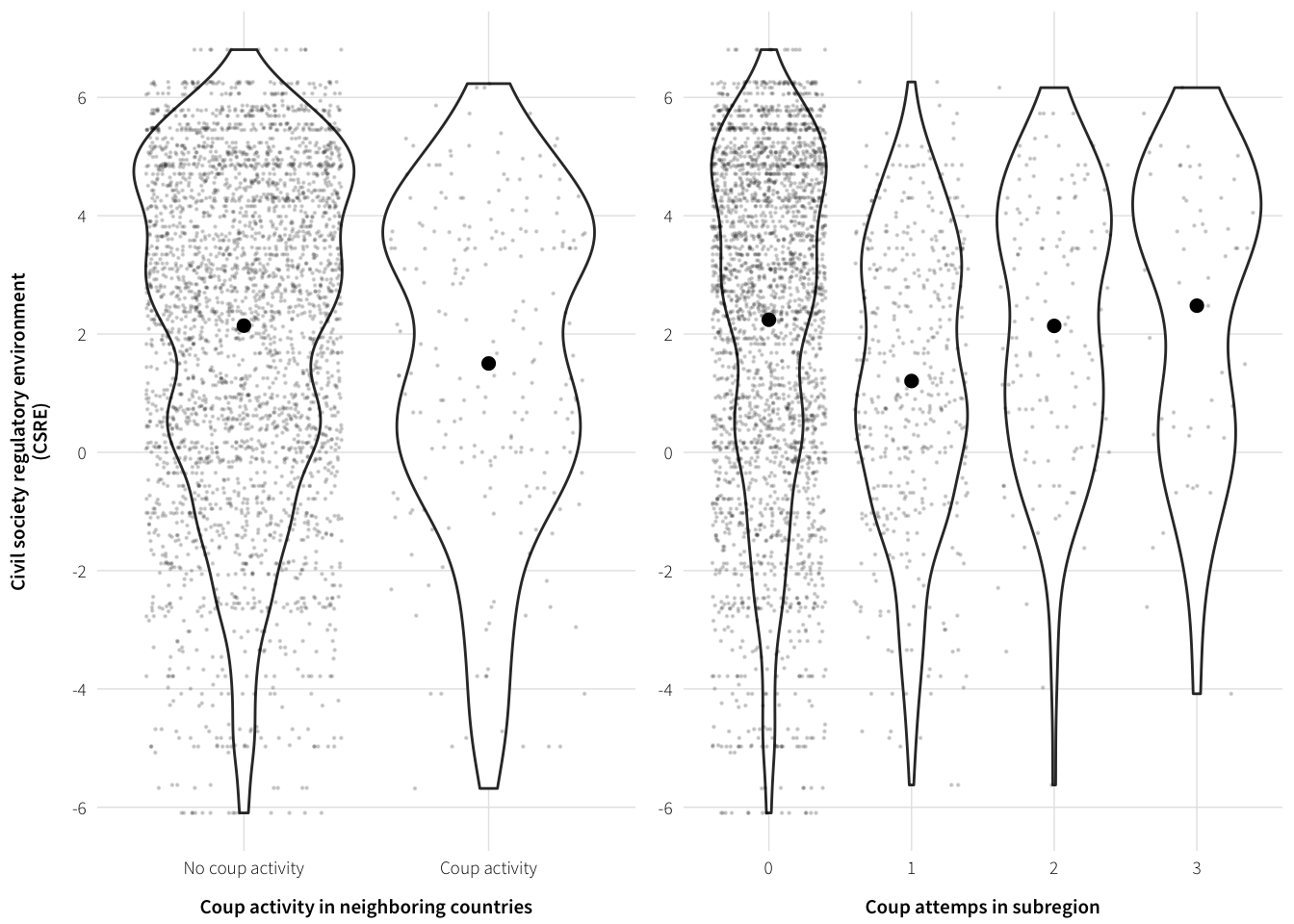
fig.save.cairo(plot.coup.vars, filename="1-ext-coup-vars",
               width=6, height=2)
Event data visualization
This is all old stuff that I’ve replaced with more accurate data.
# plot.data <- full.data %>%
#   select(Country, year.num, year.actual, gwf.binary,
#          icews.conflict.severity.abs, icews.pct.shame,
#          icews.conflict.severity.abs.ingos, icews.pct.shame.ingos) %>%
#   na.omit %>%
#   group_by(year.actual, gwf.binary) %>%
#   summarise(shame = mean(icews.pct.shame),
#             shame.sd = sd(icews.pct.shame, na.rm=TRUE),
#             shame.se = shame.sd / sqrt(n()),
#             shame.upper = shame + (qnorm(0.975) * shame.se),
#             shame.lower = shame + (qnorm(0.025) * shame.se),
#             shame.ingo = mean(icews.pct.shame.ingos),
#             shame.ingo.sd = sd(icews.pct.shame.ingos, na.rm=TRUE),
#             shame.ingo.se = shame.ingo.sd / sqrt(n()),
#             shame.ingo.upper = shame.ingo + (qnorm(0.975) * shame.ingo.se),
#             shame.ingo.lower = shame.ingo + (qnorm(0.025) * shame.ingo.se),
#             severity = mean(icews.conflict.severity.abs),
#             severity.sd = sd(icews.conflict.severity.abs, na.rm=TRUE),
#             severity.se = severity.sd / sqrt(n()),
#             severity.upper = severity + (qnorm(0.975) * severity.se),
#             severity.lower = severity + (qnorm(0.025) * severity.se),
#             severity.ingo = mean(icews.conflict.severity.abs.ingos),
#             severity.ingo.sd = sd(icews.conflict.severity.abs.ingos, na.rm=TRUE),
#             severity.ingo.se = severity.ingo.sd / sqrt(n()),
#             severity.ingo.upper = severity.ingo + (qnorm(0.975) * severity.ingo.se),
#             severity.ingo.lower = severity.ingo + (qnorm(0.025) * severity.ingo.se)) %>%
#   mutate(gwf.binary = factor(gwf.binary, levels=c("Democracy", "Autocracy"),
#                              labels=c("Democracies    ", "Autocracies")))
#
# #' ## Interstate shame percent and severity
# plot.states.shame <- ggplot(plot.data, aes(x=year.actual, y=shame,
#                                            colour=gwf.binary)) +
#   geom_ribbon(aes(ymin=shame.lower, ymax=shame.upper, fill=gwf.binary),
#               alpha=0.3, colour=NA) +
#   geom_line(size=1.5) +
#   labs(x=NULL, y="Mean percent of all interstate\nevents that are conflictual") +
#   scale_colour_manual(values=c(col.dem, col.auth), name=NULL) +
#   scale_fill_manual(values=c(col.dem, col.auth), name=NULL, guide=FALSE) +
#   scale_y_continuous(labels=percent, limits=c(0, 1)) +
#   theme_ath()
#
# plot.states.severity <- ggplot(plot.data, aes(x=year.actual, y=severity,
#                                               colour=gwf.binary)) +
#   geom_ribbon(aes(ymin=severity.lower, ymax=severity.upper, fill=gwf.binary),
#               alpha=0.3, colour=NA) +
#   geom_line(size=1.5) +
#   labs(x=NULL, y="Mean intensity of\ninterstate conflictual events") +
#   scale_colour_manual(values=c(col.dem, col.auth), name=NULL) +
#   scale_fill_manual(values=c(col.dem, col.auth), name=NULL, guide=FALSE) +
#   scale_y_continuous(limits=c(0, 10)) +
#   theme_ath()
#
# plot.events.states <- arrangeGrob(plot.states.shame, plot.states.severity, nrow=1)
# grid::grid.draw(plot.events.states)
#
# fig.save.cairo(plot.events.states, filename="1-events-states",
#                width=6, height=2)
#
# #' Check if the difference in average shame percent is significant in each year
# year.diffs <- full.data %>%
#   select(gwf.binary, year.num, icews.conflict.severity.abs) %>%
#   na.omit() %>%
#   group_by(year.num) %>%
#   do(tidy(t.test(icews.conflict.severity.abs ~ gwf.binary, data=.)))
#
# year.diffs %>% select(1:6) %>% print(n=nrow(.))
# #' Nope, not really.
# #'
#
# #' Check if the difference in average severity is significant in each year
# year.diffs <- full.data %>%
#   select(gwf.binary, year.num, icews.pct.shame) %>%
#   na.omit() %>%
#   group_by(year.num) %>%
#   do(tidy(t.test(icews.pct.shame ~ gwf.binary, data=.)))
#
# year.diffs %>% select(1:6) %>% print(n=nrow(.))
# #' Again, nope.
# #'
#
# #' ## INGO shaming percent and severity
# plot.ingos.shame <- ggplot(plot.data, aes(x=year.actual, y=shame.ingo,
#                                           colour=gwf.binary)) +
#   geom_ribbon(aes(ymin=shame.ingo.lower, ymax=shame.ingo.upper, fill=gwf.binary),
#               alpha=0.3, colour=NA) +
#   geom_line(size=1.5) +
#   labs(x=NULL, y="Mean percent of all INGO-state\nevents that are conflictual") +
#   scale_colour_manual(values=c(col.dem, col.auth), name=NULL) +
#   scale_fill_manual(values=c(col.dem, col.auth), name=NULL, guide=FALSE) +
#   scale_y_continuous(labels=percent, limits=c(0, 1)) +
#   theme_ath()
#
# plot.ingos.severity <- ggplot(plot.data, aes(x=year.actual, y=severity.ingo,
#                                              colour=gwf.binary)) +
#   geom_ribbon(aes(ymin=severity.ingo.lower, ymax=severity.ingo.upper, fill=gwf.binary),
#               alpha=0.3, colour=NA) +
#   geom_line(size=1.5) +
#   labs(x=NULL, y="Mean intensity of\nINGO-state conflictual events") +
#   scale_colour_manual(values=c(col.dem, col.auth), name=NULL) +
#   scale_fill_manual(values=c(col.dem, col.auth), name=NULL, guide=FALSE) +
#   scale_y_continuous(limits=c(0, 10)) +
#   theme_ath()
#
# plot.events.ingos <- arrangeGrob(plot.ingos.shame, plot.ingos.severity, nrow=1)
# grid::grid.draw(plot.events.ingos)
#
# fig.save.cairo(plot.events.ingos, filename="1-events-ingos",
#                width=6, height=2)
#
# #' Check if the difference in average shame percent is significant in each year
# year.diffs <- full.data %>%
#   select(gwf.binary, year.num, icews.conflict.severity.abs.ingos) %>%
#   na.omit() %>%
#   group_by(year.num) %>%
#   do(tidy(t.test(icews.conflict.severity.abs.ingos ~ gwf.binary, data=.)))
#
# year.diffs %>% select(1:6) %>% print(n=nrow(.))
# #' Nope.
# #'
#
# #' Check if the difference in average severity is significant in each year
# year.diffs <- full.data %>%
#   select(gwf.binary, year.num, icews.pct.shame.ingos) %>%
#   na.omit() %>%
#   group_by(year.num) %>%
#   do(tidy(t.test(icews.pct.shame.ingos ~ gwf.binary, data=.)))
#
# year.diffs %>% select(1:6) %>% print(n=nrow(.))
# #' Nope.
# #'
#
# #' All four plots at the same time
# plot.events <- arrangeGrob(plot.states.shame + theme(legend.position="none"),
#                            plot.states.severity + theme(legend.position="none"),
#                            plot.ingos.shame, plot.ingos.severity)
# grid::grid.draw(plot.events)
#
# fig.save.cairo(plot.events, filename="1-events-both",
#                width=6, height=4)